IEM Daily Feature
Tuesday, 02 January 2018
Tuesday, 02 January 2018
Decreasing Range
Posted: 02 Jan 2018 05:31 AM
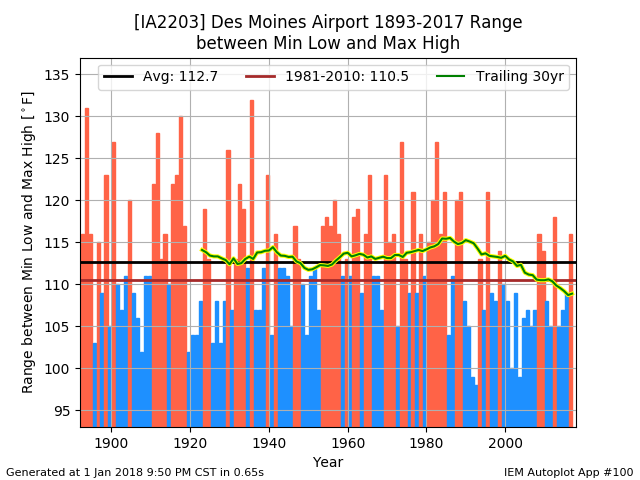
Yesterday's featured map displayed the range between the coldest low and warmest high
temperature for 2017 over the CONUS. Today's featured chart shows the long term trend of
this temperature range by year for Des Moines. Besides the yearly bars representing the
temperature ranges, the chart also has long term and recent averages and the trailing 30
year average (yellow highlighted line). That trailing average is rather interesting as it
shows a downward trend in range over the past 30 years or so. 2017 bucked this trend
somewhat coming in well above the three averages shown.
Voting:
Good = 6
Bad = 1
Voting:
Good = 6
Bad = 1

