IEM Daily Feature
Tuesday, 10 April 2012
Tuesday, 10 April 2012
Differences in cooling rates
Posted: 10 Apr 2012 05:53 AM
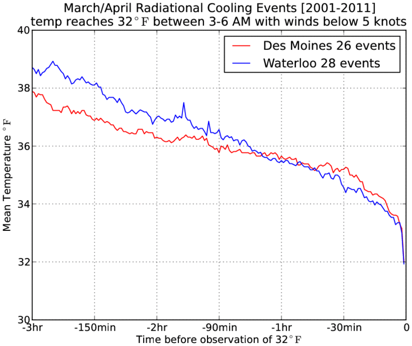
The featured chart is an attempt to illustrate differences in over
night cooling rates by showing a composite profile of temperature for a
three hour period prior to reaching a freezing temperature. The
airport weather sensor in Des Moines is in a very urban area, while the
Waterloo sensor is on the edge of town. The slope of these two lines
is slightly different showing a faster cooling rate for Waterloo. This
is an illustration of the "heat island" effect that is caused by having
lots of heat retaining buildings and pavement nearby the weather
sensor.
Voting:
Good = 16
Bad = 3
Tags: heatisland
Voting:
Good = 16
Bad = 3
Tags: heatisland

